


- TRENDING
-
 The 30 Most Powerful Arm Exercises For Titanic, Toned Arms[I] can't shake the image of a Barbie & Ken factory. Whether you prefer titanic, sleeve-bursting arms or toned, defined, lean cannons, the following 30 exercises are powerful tools to help...
 -
 Irish It UP — The Supercharged Shamrock Protein Shake [Recipes][G]et festive and IRISH IT UP this St. Patty's Day with our Supercharged Shamrock Protein Shake. Using a combo of uber-nutritious, powerhouse ingredients—including AVOCADO (yes, AVOCADO),...
 -
 Melt Fat And Burn Up Your Legs With The Stairmaster Blaster HIIT Cardio Workout[S]tep up your HIIT game. If you're looking to build a plump, Jen Selter-esque booty, demolish your legs, and send fat pouring off like Victoria Falls, amp up the intensity with...
 -
 The Workout Music Friday Five-Pack, V23 — Big Gigantic, Kanye West, Nicki Minaj, & Deorro[G]et amped. Every Friday we're dropping a five-pack of heart-thumping, blood-pumping workout songs to build out your playlist, hardwire a little energy into your workouts, and kickstart the...
 -
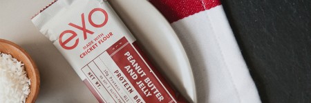 Would You Eat Crickets? Cricket Flour Might Just Be The New Protein Powder[P]rotein, protein, protein. We preach the benefits nonstop as an integral part of any lean physique. But what if we told you there was a buzzworthy new protein source that offered...
 -
 [WOTM, 03/2015] Carve Up Your Core For Beach Season With The Summer Shredder Ab Workout[O]oh la la. This is about to get oh-so-fun. We're going to make your abdominal life a living, burning hell for the next 3 months pre-summer. You'll thank us on the other side. March's WOTM—The...
 -
 The Workout Music Friday Five-Pack, V22 — Kanye West, Zedd, Selena Gomez, Big Sean, & Laidback LukeImage: MusclePharm [G]et amped. Every Friday we're dropping a five-pack of heart-thumping, blood-pumping workout songs to build out your playlist, hardwire a little energy into your workouts,...
 -
 Game, Set, Match — Start Sipping More Coffee, ASAP [Report][B]ADABOOM! Sip it up and suck it down, coffee junkie. You're officially in the clear. The USDA and U.S. Department of Health and Human Services (HHS) recently published their latest 5-year...
 -
 Cafeteria Crisis — Here's What Cafeteria Lunches Look Like Around The World Vs. The US [Infographic][T]his is stunning. Visual News put together a compilation of cafeteria lunches from around the world. Let's just say it's not pretty, unless you're in school outside of the US. At a very...
 -
 The 13 Best Chest Exercises To Pummel Your Pecs And Build An Iron-Clad Chest[S]truggling to add mass, width, and stunning HD resolution to your chest? Crank up the poundage and start pushing weight. An iron-clad, barrel chest immediately projects Hulk-like strength...
 -
 [Review] The Energy Bar Power Rankings — The 52 Best Energy Bars Ripped Open And Ranked[S]NACK IT UP. Whether you're hopping from airport to airport jet-setting across the globe, jumping between classes, summiting mountains, or doing HIIT-style sprints just to make your next...
 -
 The Workout Music Friday Five-Pack, V21 — Drake, Alesso, CHVRCHES, Eric Prydz, and Vicetone[G]et amped. Every Friday we're dropping a five-pack of heart-thumping, blood-pumping workout songs to build out your playlist, hardwire a little energy into your workouts, and kickstart the...
-


![We’re Ranked 34th In Life Expectancy — Eat These Global Power Foods To Boost Longevity [Infographic]](../../wp-content/uploads/2014/12/Screenshot-2014-12-09-16.01.51-130x130.png)
We’re Ranked 34th In Life Expectancy — Eat These Global Power Foods To Boost Longevity [Infographic]
According to the World Health Organization (WHO) the average life expectancy in the US stacks up at 79 years — that’s good for 34th overall worldwide. Not surprisingly, FOOD plays a major role. Here are a few of the top foods eaten globally by the world’s healthiest countries.
Read More![How Hilary Knight Got That ESPN Body Edition Body [Infographic]](../../wp-content/uploads/2014/07/Screenshot-2014-07-09-17.39.14-130x130.png)
How Hilary Knight Got That ESPN Body Edition Body [Infographic]
If you have no idea who Hilary Knight is, or why she was included in ESPN’s 2014 Body Issue, get acquainted. ESPN went total access and stole a few secrets behind how she sculpted one of the most elite bodies on earth. Hint: they include coconut water, almond butter, fire cups, and my personal favorite — goblet squats.
Read More![[Infographic] This Is How Many Calories Worth Of Coke, Skittles, & Gummy Bears Are In Your Starbucks Drink](../../wp-content/uploads/2014/03/starbucks_drinks3-130x130.png)
[Infographic] This Is How Many Calories Worth Of Coke, Skittles, & Gummy Bears Are In Your Starbucks Drink
This quirky infographic from I Love Coffee takes it to the next level by illustrating the caloric calamity of most Starbucks concoctions in terms of things like Pizza, Skittles, and Gummy Bears.
Read More![[Infographic] How To Foam Roll Your Way To Reduced Pain, Regenerated Muscles, And Improved Mobility](../../wp-content/uploads/2013/12/20110526InvictusRoller9343-631x421-130x130.jpg)
[Infographic] How To Foam Roll Your Way To Reduced Pain, Regenerated Muscles, And Improved Mobility
Whether you’re a world-class athlete, running aficionado, or lifting legionnaire, foam rolling is an absolute must-do for anyone that exercises regularly. Between reducing soreness; boosting flexibility and range of motion; and alleviating pain from runner’s knee and sciatica, foam rolling is a critical technique that packs massive benefits.
Read More![[Infographic] The Cost Of Obesity](../../wp-content/uploads/2013/04/Capture-130x130.png)
[Infographic] The Cost Of Obesity
In 2004, the CDC ranked obesity as the number one health risk facing America. Today, we are still facing massive risk — if obesity rates continue on their current trajectories, 44% of Americans will be obese by 2030. The George Washington University shares its infographic detailing the startling rise in obesity and the ridiculous cost associated with it.
Read More![Organic, Organic, Organic — What Does Organic Really Mean? [Infographic]](../../wp-content/uploads/2012/11/usda_organic1-130x130.png)
Organic, Organic, Organic — What Does Organic Really Mean? [Infographic]
Despite tremendous growth and popularity, most people don’t really know what organic means and which organic foods are worth the investment. Get the visual details on all things organic inside.
Read More![Good Carbs Vs. Bad Carbs — How To Tell The Difference [Infographic]](../../wp-content/uploads/2012/09/Doughnuts-130x130.jpg)
Good Carbs Vs. Bad Carbs — How To Tell The Difference [Infographic]
Understanding different types of carbs is the golden ticket to weight loss. Here’s the comprehensive visual guide to good carbs vs. bad carbs, the glycemic index, and how it all impacts weight-loss.
Read More![Are Bananas as Bad for You as Cookies? [Infographic]](../../wp-content/uploads/2012/05/Banana-nutrition-facts-130x130.jpg)
Are Bananas as Bad for You as Cookies? [Infographic]
Are bananas REALLY as bad for you as cookies? They just might be…
Read More![The Google Diet [Infographic]](../../wp-content/uploads/2012/04/social_google_box-130x130.png)
![A Picture of HFCS and Obesity…or Two [Infographics]](../../wp-content/uploads/2011/03/ertert-130x130.jpg)
Social Hub


- 616 Posts
- 12,544 Followers
- 414 Following


 Lean It UP is a web community that touches all ends of the fitness spectrum. We regularly publish workout plans, nutritional analysis, product reviews, supplement advice, recipes, and other related content that can help inform and educate on the most effective, practical ways to improve fitness levels, aesthetics, and overall health. We want to help YOU build your own perfect body -- hop on for the ride.


